

Guidelines
This section establishes the University’s tone of voice and visual elements, which will ultimately shape our brand’s overall look, feel, and mood. Together, these elements will bring U of T’s vision, mission, value proposition, and character to life in emotional and engaging ways. Correct use is vital to ensuring the delivery of a consistent experience across all touchpoints. These guidelines should empower you to make creative decisions that work best for your specific marketing and communications needs. Visit these guidelines often, knowing that details may change and evolve over time.
Brand Voice
Our tone of voice embodies and expresses the University of Toronto’s personality and core values. It speaks to the tone and manner we use to define the voice of the University and ensures we are creating and maintaining a strong identity, with consistency and purpose in all our communications. When we all use a consistent voice, we live up to our brand strategy, and we empower all communicators within the University to connect with their specific audiences.
Who We Are
We Are Inclusive
At the University of Toronto—residing in the world’s most diverse city—we’re bringing together bright people from every conceivable background, culture, and discipline. We exist to empower people to achieve their full potential. We believe in asking bold questions and collaborating on the world’s toughest challenges because we know that we can achieve more when we work together.
We Are Visionaries
We envision things previously thought impossible. We imagine the world we want to live in and then take the steps to make it a reality. Our community is committed to developing groundbreaking ideas about what the future will and could look like. Together, we shape the future we believe in.
We Are Creative
Our students and faculty are remarkably creative. It’s how we look at the problems in front of us and how we explore new ways of doing things. Our creativity allows us to generate knowledge, ideas, and possibilities that make a tangible difference in the world.
We Are Collaborative
Our community thrives on collaboration. We are bound together in our desire to make waves and create a better world for us all. We recognize that alone, we can accomplish great things. But when we come together to work towards shared goals, we can make lasting, game-changing impact. Our experts converge from nearly every field, collaborating across disciplines and geographical boundaries.
We Are Evidence-based
U of T is home to some of the world’s most talented thinkers, inventors, innovators, and educators. Together, we believe in facts, evidence, and integrity.
We Are Fearless
We do not see the impossible as some foregone conclusion. We are not afraid to explore. We don’t let obstacles or setbacks deter us. We defy conventional thought and push the limits of knowledge. Part of being fearless is about always being curious. Our community is always asking questions. What if? Why not? Why not now? These questions are catalysts that expand our knowledge and hold the potential to fundamentally alter how we understand ourselves and the world around us.
We Are Empathetic
We are smart, but we aren’t robotic. We genuinely care for each other and the world at large. We provide an unwavering commitment to opening new vistas for human expression, scientific discovery, and social progress that the world so desperately craves.
Tone and Manner
In order to successfully convey who we are at the University of Toronto, our tone and manner must be:
Inspiring
Provide hope for today and for the future.
Energetic
We’re enthusiastic about the work we do at U of T, and we want our readers and viewers to be too. Show that we’re excited, optimistic, and provide a sense of momentum.
Intelligent
We strive to convey information clearly, but we don’t boast or brag. Part of our intelligence is breaking down complicated research jargon into approachable, easy-to-understand terms.
Human
Insulin didn’t invent itself. Behind every great breakthrough are the people who made it happen. Students, researchers, donors, alumni. They’re human. Make sure you speak to them as such.
Caring
Always show how we genuinely care about our community. Celebrate the work that we have done, but also the impact it has had.
Our Writing Style
When developing copy, please keep the following top of mind:
Speak to Impact
We aim to inform but also inspire with our stories. Make sure the impact of what you’re describing is tangible and relatable. Don’t leave the reader wondering, so what?
Write In an Active Voice
It’s clearer, requires fewer words, and centres copy around the doer, helping us celebrate who did something—an inspiring student, researcher, award winner, etc.—as well as what they did.
Active: U of T researchers were the first to uncover GhostNet—a massive cyber-espionage network.
Passive: GhostNet—a massive cyber-espionage network—was first uncovered by U of T researchers.
Keep Copy Free of Hyperbole
Be judicious with words like revolutionary, groundbreaking, game-changing, breakthrough, etc. Don’t overpromise and claim we’re going to cure something or solve a global problem like climate change. While that may be our goal, our audience includes people who will scrutinize every word and expect them to be backed up with evidence. Say we’re working, aiming, tackling, trying, collaborating, leveraging our breadth and depth across disciplines, etc.
Favour Optimism
The world faces many grave challenges, and it’s tempting to dwell on the negative. As much as possible, we want to present an optimistic vision for the future. Focus on how our students and faculty are addressing these issues.
Keep Your Audience in Mind
Always put yourself in the shoes of your audience. Is it a Facebook or transit shelter ad or a room full of astrophysicists? Prospective donors or prospective students? Don’t presume people outside the University will understand academic terms and titles, but don’t talk down to readers either. Use smart, everyday language.
Be Clear and Concise
Focus on the single most important message you are trying to convey, and remove anything distracting or unnecessary. Avoid jargon or insider language that might alienate the reader.
Community Over Institution
When possible, use direct quotes from U of T community members (i.e., real students, faculty, staff, and alumni) to tell honest Defy Gravity stories and our institutional voice to support the narrative. We don’t take credit for people’s accomplishments—U of T is fortunate to support this great work.
But Be Judicious With Quotes
If you’re using quotes, make sure they have a purpose and don’t repeat information but elevate or advance it. If they contain jargon or errors, paraphrase them rather than using too many square brackets, which are confusing to readers. In general, always use double quotation marks except for headlines and quotes within a quote.
Don’t Overuse the Words “Defy” and “Gravity”
We’ll be telling many stories of how the U of T community is defying gravity metaphorically, but use the phrase itself sparingly and don’t stretch it by using related phrases like “float above,” “defy the laws of physics,” etc. You can easily describe how our community defies gravity without ever using those words in body copy.
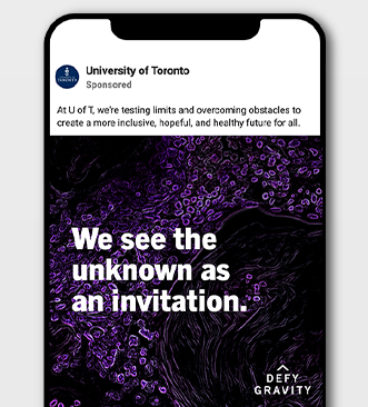
What Makes a Defy Gravity Story?
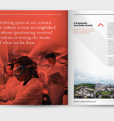
Defy Gravity stories are about overcoming obstacles to achieve something profound and inspiring. Of course, that includes historic U of T milestones such as discovering insulin or becoming the first Canadian woman to go to space. But it also encompasses more personal triumphs like the student who’s the first in their family to attend university, took an arduous path to get here, or tested their own limits to accomplish something meaningful.
Defy Gravity also speaks to our mindset as a community. We don’t just accept the world as it is. We have a defiant streak. We don’t shrink from big challenges. We’re a community that wants to change the world for the better. We may not always succeed, but we don’t let that hold us back. We use every setback as motivation to push forward. Defy Gravity is shorthand for our character, values, mettle, and view of the world.
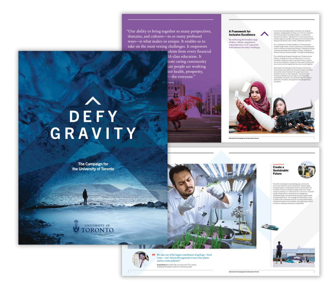
Defy Gravity also expresses our commitment to inclusive excellence. For us, excellence is inclusive excellence. Our community embraces the broadest range of ideas, cultures, experiences, and perspectives, which results in bold and compassionate thinking. Thinking that disrupts conformity. Thinking that shifts the calculus of what’s possible. Thinking that defies gravity.
This is what the world needs most right now. Thinkers who are willing to challenge orthodoxy, ask big questions, and push boundaries. People who want to rise above division, cynicism, and narrow-mindedness. People who never cease to believe that we can overcome the toughest barriers when we work together. These are the kinds of people we want to tell stories about.
A Defy Gravity Story Checklist:
- Does it show a positive impact on an individual, a group, a community, or the world at large?
- Does it highlight U of T’s commitment to inclusive excellence?
- Does the story incorporate collaboration and something unique to U of T? Are we highlighting our breadth, depth, interdisciplinarity, and the chemistry we make when we work together?
- Is it authentic? Does it put people first? Are we celebrating students, faculty, and alumni versus the University that helped them?
- Is it relatable? We’re celebrating achievements, but are we also highlighting some of the obstacles and triumphs that were part of the creative process?
- Is it interesting? Will it hold the reader’s attention?
Headlines
In an age of information overload, headlines can make the difference between stopping to learn more or scrolling or walking on by. Good headlines capture our audience’s attention, creating curiosity that motivates people to read further and take action. They also help to frame the Defy Gravity story we’re telling and offer a lens through which to understand it.
We have developed four headline constructs to start with. All approaches support the overall tone of Defy Gravity and provide succinct ways to communicate our inclusive excellence.
Please select the approach that best suits the message you are trying to convey while considering the medium and context in which the copy will appear.
As the brand evolves, we’ll update the Brand Portal with more options and styles. We’d love to hear about your ideas and approaches that resonate with your audience.
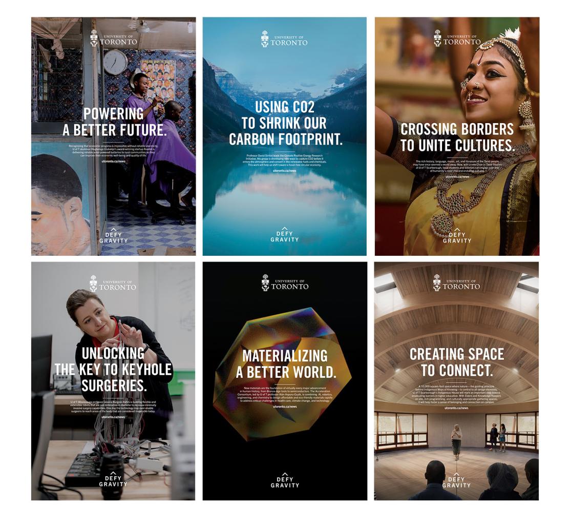
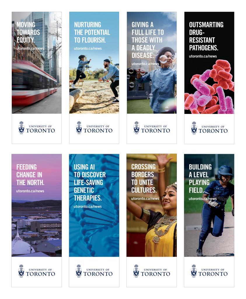
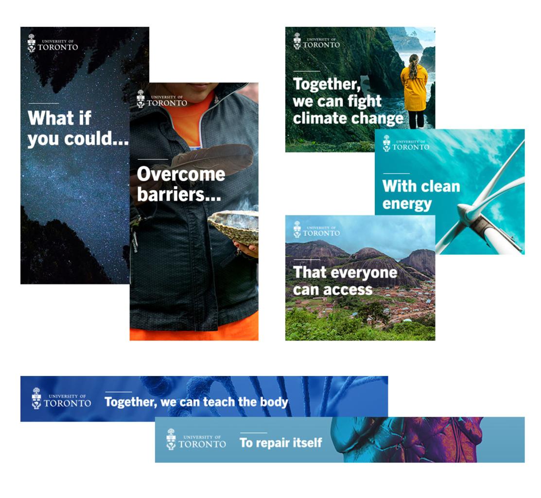
Headline Direction 1: How’s That Possible?
These headlines use wordplay to generate curiosity and challenge reader expectations. They use gerunds (ending in -ing) to provide a sense of momentum and action, offering a connection to Defy Gravity and showcasing a unique and intriguing U of T solution.
Examples
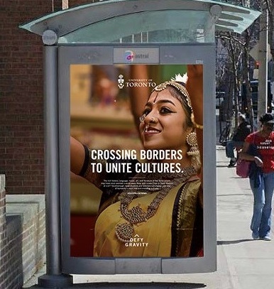
Using CO2 to reverse our carbon footprint.
Breaking the glass ceiling from space.
Living a full life with a deadly disease.
Headline Direction 2: In Their Words
There’s nothing like a powerful, pithy, and authentic quote to grab someone’s attention and build a sense of connection and empathy. They allow us to amplify diverse and inspiring voices from across our campuses and celebrate stories of personal triumph. They must be real!
Keep quotes short, preferably around seven words. Use single quotation marks in headlines and decks.
Examples
‘I changed space.’
‘They doubted me, but here I am.’
‘Doctors should reflect the community they serve.’
Headline Direction 3: What’s Next?
These headlines lean into the University of Toronto’s legacy, acting as a reminder of the historic breakthroughs that have occurred across our campuses and showing that our groundbreaking work continues. Start with a succinct fact, followed by a closely related and visionary question tied to specific research.
Examples
We discovered insulin.
Is the next diabetes breakthrough within reach?
We developed the Glycemic Index.
Can we fundamentally alter the way we eat next?
We pioneered machine learning.
Could it hold the key to unlocking genetic disorders?
Headline Direction 4: Help Drive the Solution
These headlines (which appear with initiatives on the campaign website) highlight a U of T solution to a specific problem. They use imperative verbs (build, create, teach, transform, etc.) to create a sense of urgency and to compel the reader to join us to address a difficult challenge. They’re short and direct, ideally 4-8 words.
Examples
Teach the body to repair itself.
Stop heart failure’s fatal progression.
Bring health-care innovations out of the lab.
Visual Identity
Our visual identity elements are a critical component of our communications toolkit. They act as our visual language, helping to reinforce our brand personality and our Defy Gravity message.
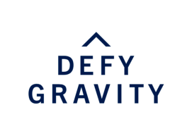
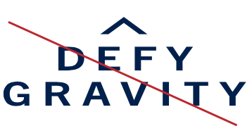
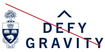
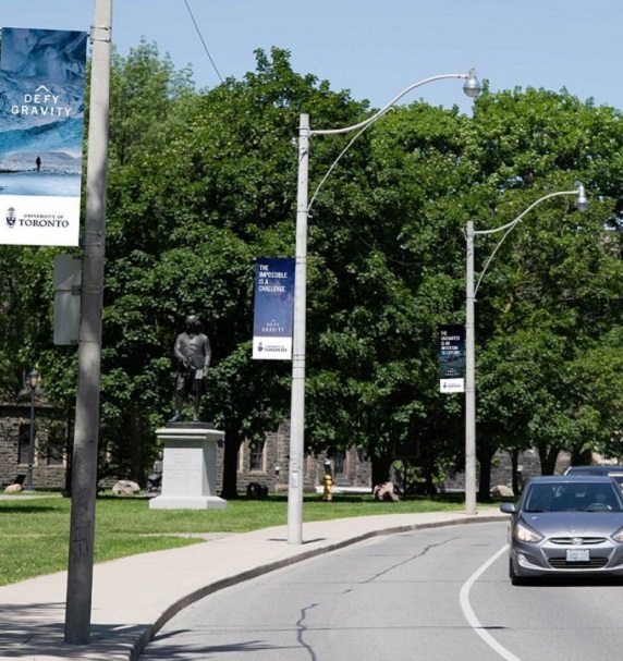
The Defy Gravity Mark
![]()
The Defy Gravity mark visually represents U of T’s belief that our community of thinkers and doers can rise above any challenge.
The Caret symbol signifies exponential power, while the type treatment provides a sense of weightlessness. Together, these elements convey a sense of ascending, expanding, and changing the calculus of what’s possible.
The font used in the Defy Gravity mark is Trade Gothic Next Bold — set in all caps with expanded tracking. Using U of T’s official brand colour (Pantone® 655), it’s a distinct mark that reinforces U of T’s legacy identity.
These two elements should always remain intact and in the correct order.
Note: Although the Caret alone can be modified and used as a graphic element for campaign creative, never alter it when used in the Defy Gravity mark.
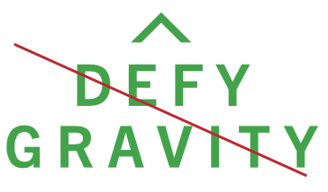
Mark Colour
The Defy Gravity mark’s official brand colour is U of T Blue (Pantone® 655).
|
CMYK: 100/79/12/59 |
We recommend using the black mark only when colour is not permitted or available.
When the mark is on a background that is dark coloured or busy (i.e. a photograph), we recommend using the reverse mark.
Note: The Defy Gravity mark can only be placed over an image provided the image does not impede the visibility of the mark or compromise its integrity in any way.
Defy Gravity mark in
U of T Blue (Pantone® 655).
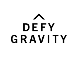
Defy Gravity mark in black
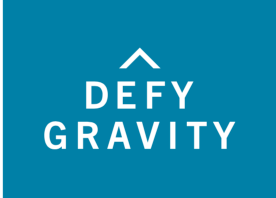
Defy Gravity mark in reverse on coloured background.
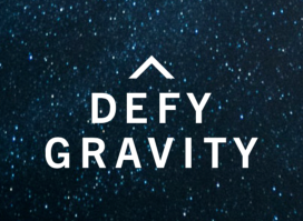
Defy Gravity mark in reverse on an image.
Clear Space and Minimum Size
Clear Space
There must always be a minimum margin of clear space around the Defy Gravity mark. The minimum clear space is equal to the height of the capital “E.”

The mark should never be closer to an edge (page, sign, screen, etc.) than the minimum clear space.
Minimum Size
The minimum size is 0.6” wide for print applications and 44 pixels wide for digital applications. Our standard for minimum size ensures mark readability and visual presence.

Note: Exceptions will be made where appropriate (e.g. social media avatars and merchandise).
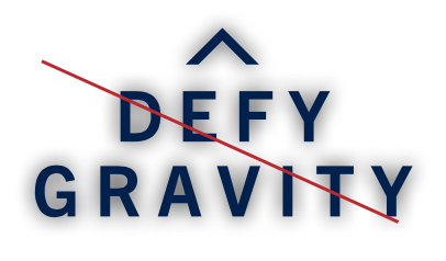
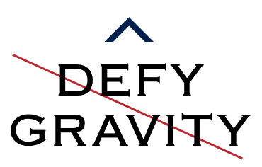
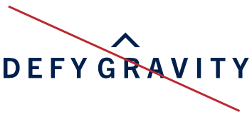
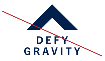
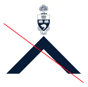
Improper Usage
These examples illustrate improper use of the Defy Gravity mark. Altering or manipulating the approved mark artwork is never permitted.
Use the Defy Gravity mark correctly to preserve the mark’s visual impact and integrity.
Only reproduce the mark from approved electronic artwork.
Note: These are examples only and are not a complete list of incorrect usage.
Do not condense, expand or otherwise distort the mark.
Do not change the color of the mark.
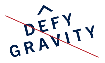
Do not angle or rotate the mark.
Do not add any drop shadows to the mark.
Do not alter the base of the Caret
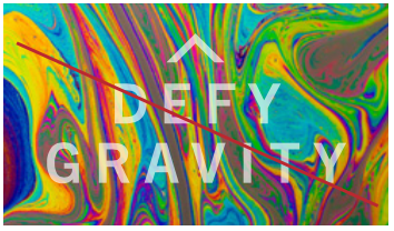
Do not use the mark as a transparent. When placing the mark over a background, ensure it is legible.
Do not put “Defy Gravity” on one line.
Do not alter the mark.
Do not add additoinal elements to the mark.
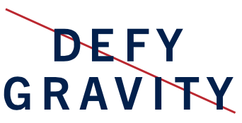
Do not use “Defy Gravity” without the Caret.
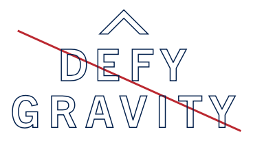
Do not alter the base of the Caret
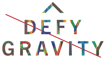
Do not use the mark as a transparent. When placing the mark over a background, ensure it is legible.
Relationship with U of T Signature
The Defy Gravity mark and U of T signature should reside in different zones, not in a lock-up. It must never look like they are competing for attention.
Note: In some applications, the Defy Gravity mark may appear without the U of T signature. In these instances, the U of T signature should appear close by. For example, a static social post on a U of T-owned channel can include the Defy Gravity mark with the U of T signature as our social avatar.
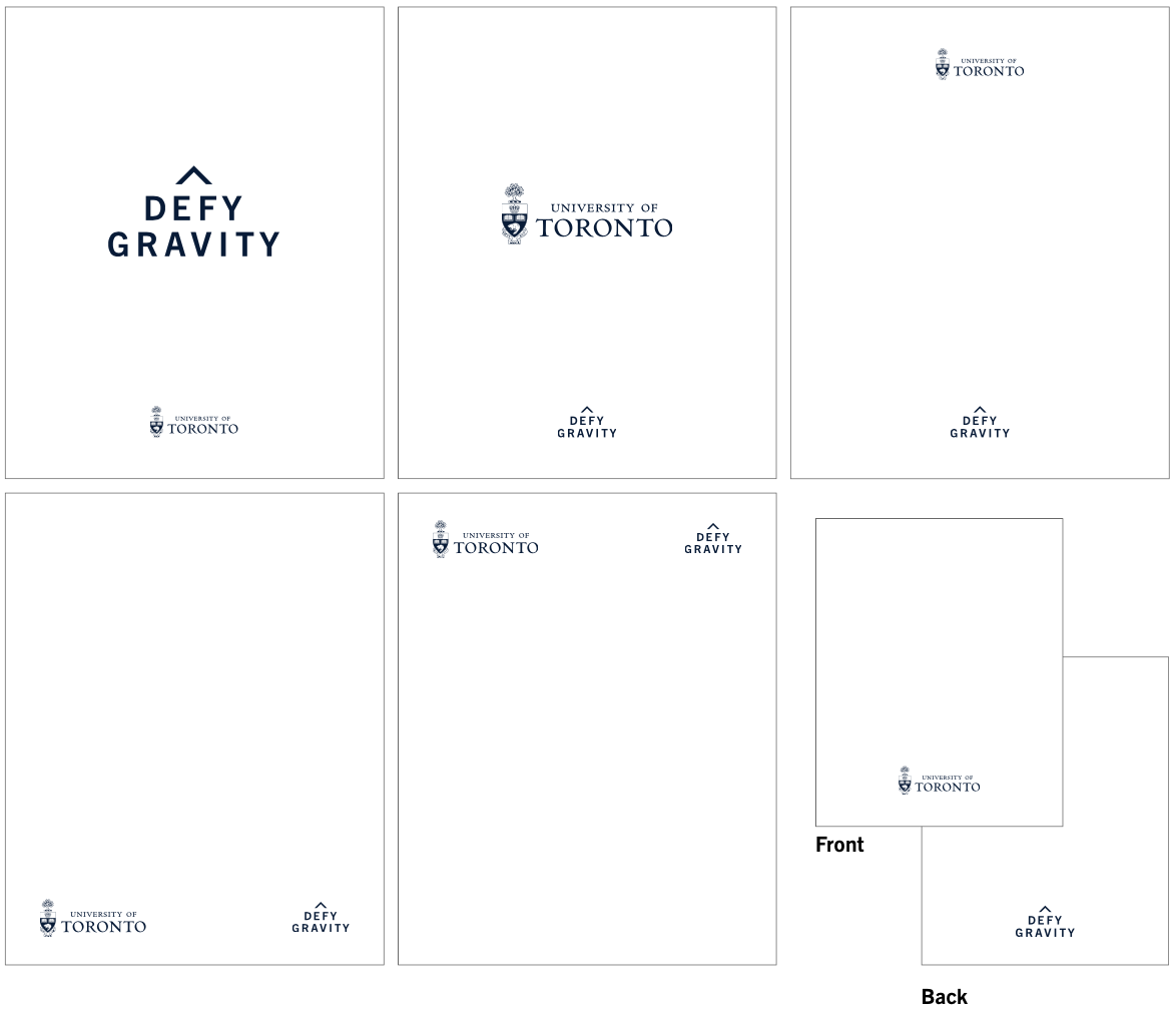
Note: You can place the two elements separately on a page, with the U of T signature on the front and the Defy Gravity mark on the back.
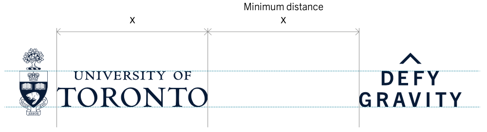
Placement
To determine the minimum distance between the U of T signature and the Defy Gravity mark, we measure the width of “Toronto” in the U of T signature, indicated here by “x.”
Note: Exceptions will be made where appropriate (e.g. email signatures).
Alignment
The top of the Defy Gravity mark should align with the top of “University of” in the U of T signature.
The baseline of the Defy Gravity mark should align with the baseline of “Toronto” in the U of T signature.
Website Footer Usage
Placement
Many websites currently include a U of T signature in both their header and footer. In these instances, we recommend that the Defy Gravity mark replace the signature in the footer. The preferred application of the mark is white on U of T Blue.

Left-Aligned (Recommended)
The preferred placement of the Defy Gravity mark is in the bottom left corner of the footer. Other footer content may be placed opposite the mark, as long as appropriate clear space around the mark is maintained as outlined in the brand guidelines.
Example:

Centred
If the content of your footer requires the Defy Gravity mark to appear centred, it can be placed below or above the footer content and separated by a white horizontal rule or on a separate colour bar.
Examples:


In-line co-branding
When a footer contains additional logos (e.g., partner logos, campaign logos, etc.), the Defy Gravity mark may be placed opposite and visually separated by footer content.
Example:

Vertical co-branding
If the Defy Gravity mark cannot be placed in-line with other logos in the footer, it can be placed below or above the footer content and separated by a white horizontal rule or on a separate colour bar.
Examples:


Typography
Our primary typefaces are Trade Gothic and Bembo.
When using Trade Gothic, the minimum font size in body copy for print should be no smaller than 9.25 point. For photo captions, asterisk notes, and legal text, the point size should be smaller but no smaller than 7 point.
When using Bembo, we use old style figures. The minimum font size in body copy for print should be no smaller than 10.5 point.
Note: The use of these typefaces requires the purchase of a commercial licence. Divisions are responsible for securing font licensing for their respective offices.
Trade Gothic
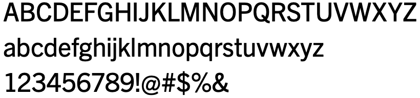
The acceptable replacement for Trade Gothic, which is available on most computer operating systems is Arial.
Bembo
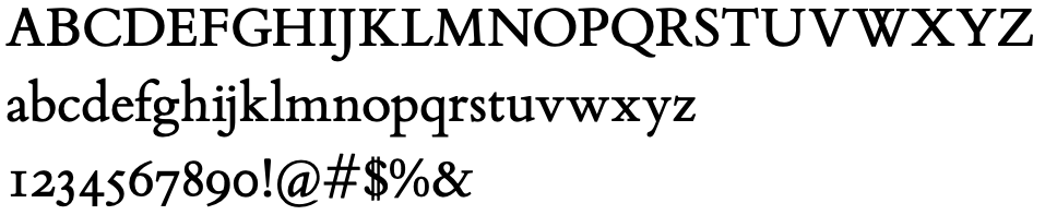
The acceptable replacement for Bembo, which is available on most computer operating systems is Times New Roman.
Colour
Primary Colour
U of T Blue is an integral element of our brand. It represents the University’s history, legacy, reputation, and excellence both locally and internationally. It connects all divisions, campuses, and the larger U of T community.
|
CMYK: 100/79/12/59 RGB: 30/55/101 HEX: #1E3765 |
We must always ensure U of T Blue’s presence within the composition of marketing and communication materials. Do not overuse the U of T Blue, particularly when using divisional colours — we recommend using it in a complementary way.
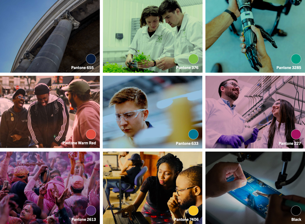
Secondary Colours
Our secondary colour palette complements the U of T Blue. Use these colours as accents only for subheads, call-outs, charts, graphs, icons, and other small editorial details to add vibrancy and energy to the brand.
Avoid using unapproved colours or creating a new colour palette, with the exception of tints of the approved colours and the varying colours in images.
CMYK: 98/6/10/29
RGB: 0/127/163
HEX: #007FA3
CMYK: 74/99/5/11
RGB: 109/36/122
HEX: #6D247A
CMYK: 0/83/80/0
RGB: 220/70/51
HEX: #DC4633
CMYK: 60/0/3/0
RGB: 111/199/234
HEX: #6FC7EA
CMYK: 98/0/59/0
RGB: 0/161/137
HEX: #00A189
CMYK: 7/100/10/21
RGB: 171/19/104
HEX: #AB1368
CMYK: 89/0/45/72
RGB: 13/83/77
HEX: #0D534D
CMYK: 0/20/100/2
RGB: 241/197/0
HEX: #F1C500
CMYK 54/0/100/0
RGB 141/191/46
HEX #8DBF2E
Neutrals
Our neutral colour palette is available for support purposes. Black can be used for headlines, body copy, and captions. Use white as a background for most instances. Cool Gray 2 is also available as a background tone where appropriate to provide impact and variety.
CMYK: 0/0/0/0
RGB: 0/0/0
HEX: #FFFFFF
CMYK: 5/3/5/11
RGB: 208/209/201
HEX: #D0D1C9
CMYK: 0/0/0/100
RGB: 0/0/0
HEX: #000000
Note: Avoid using black as a background colour.
Colour Tints
For further flexibility when using the secondary and neutrals colour palettes, we recommend using tints. We have included a sampling of percentage breakdowns; however, you can use any percentage as long as there’s enough contrast between the tint and overlayed text and/or graphics.
Whenever possible, use U of T Blue at 100%. If a tint is required, a minimum of 80% is allowed.
Note: Make sure to test print for visibility when using Pantone percentages.
U of T Pantone 655
Pantone 633
Pantone 2613
Pantone Warm Red
Pantone 3285
Pantone 2985
Pantone 227
Pantone 7722
Pantone 7406
Pantone 376
Black
Pantone Cool Gray 2
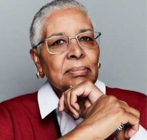
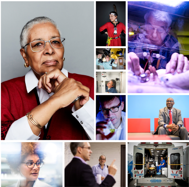
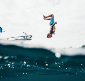
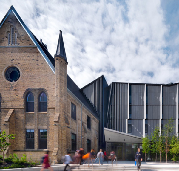
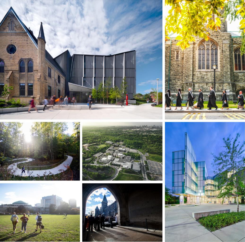
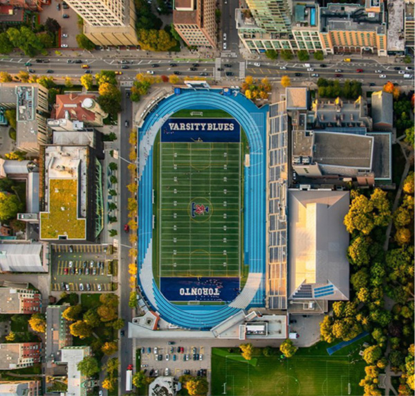
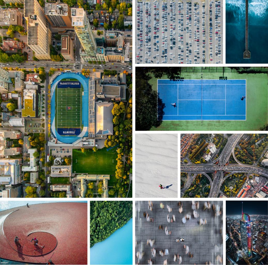
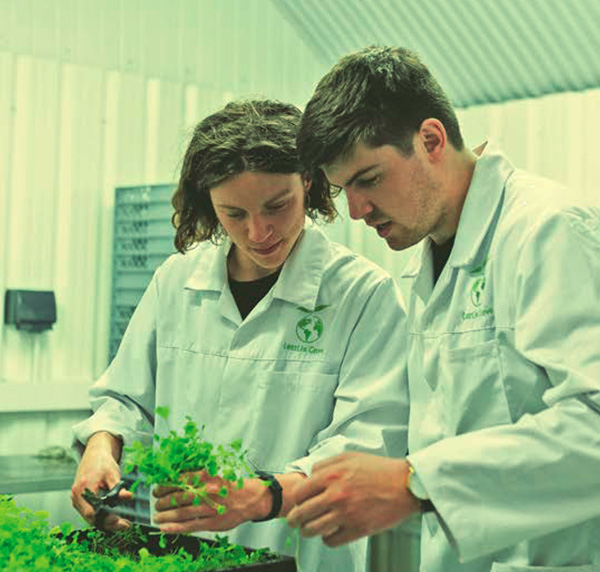
Photography
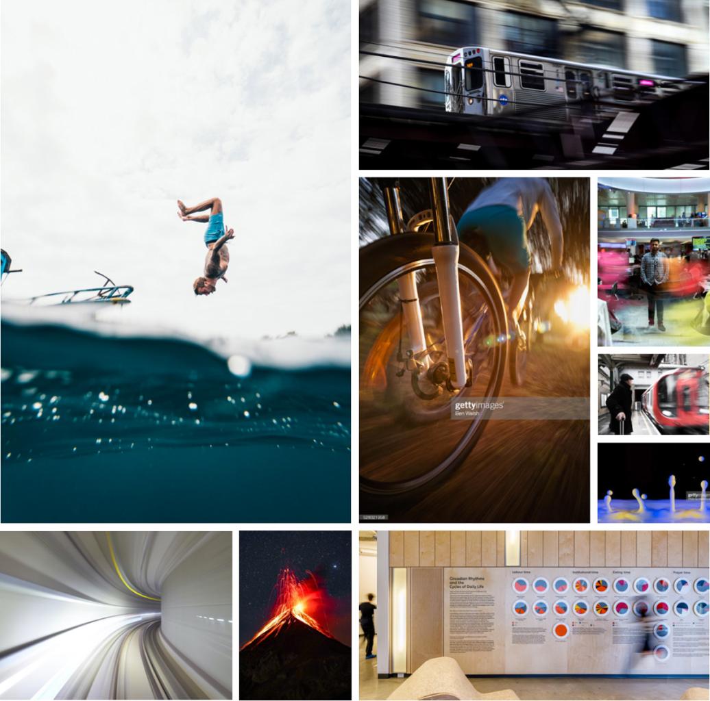
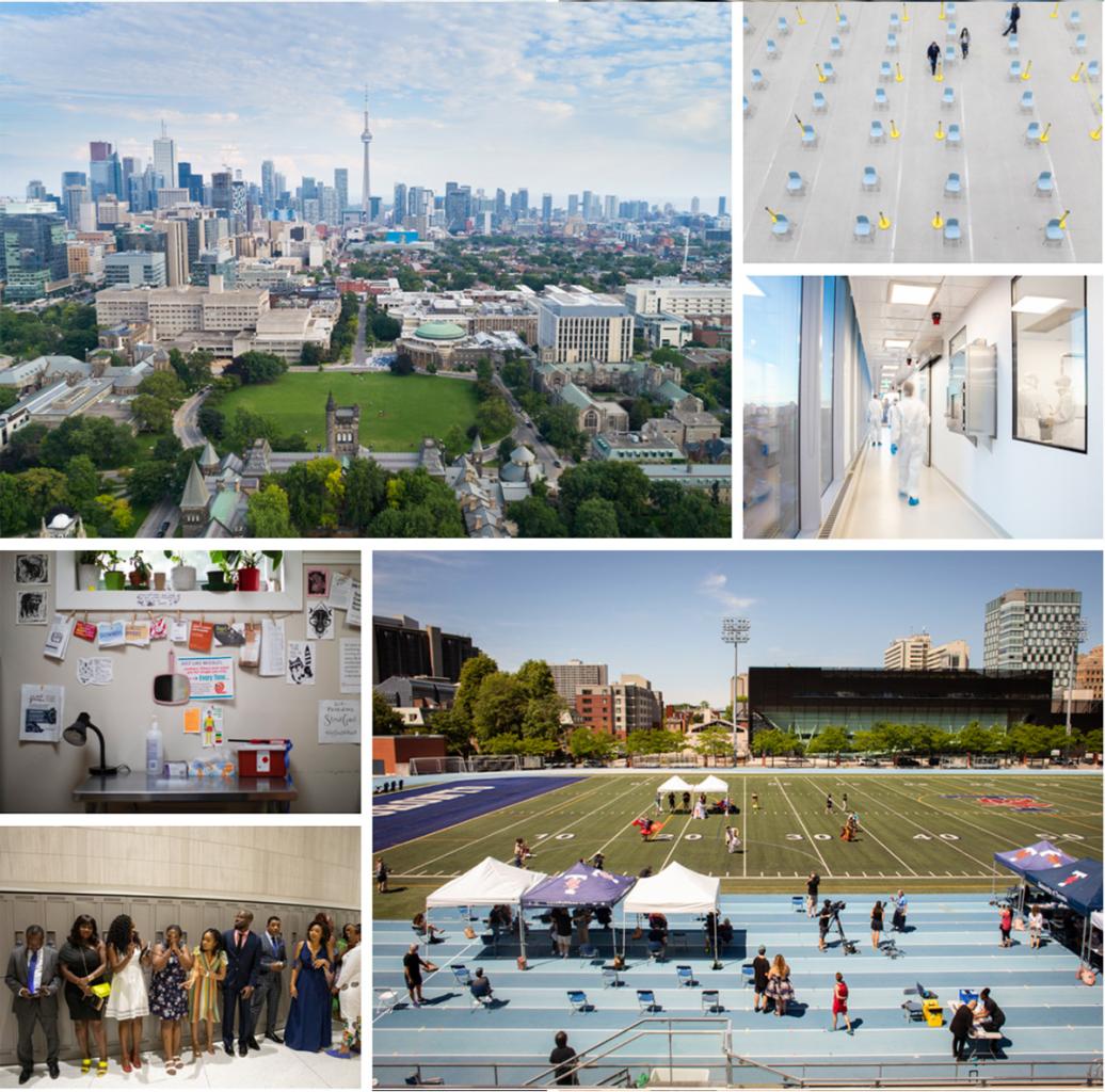
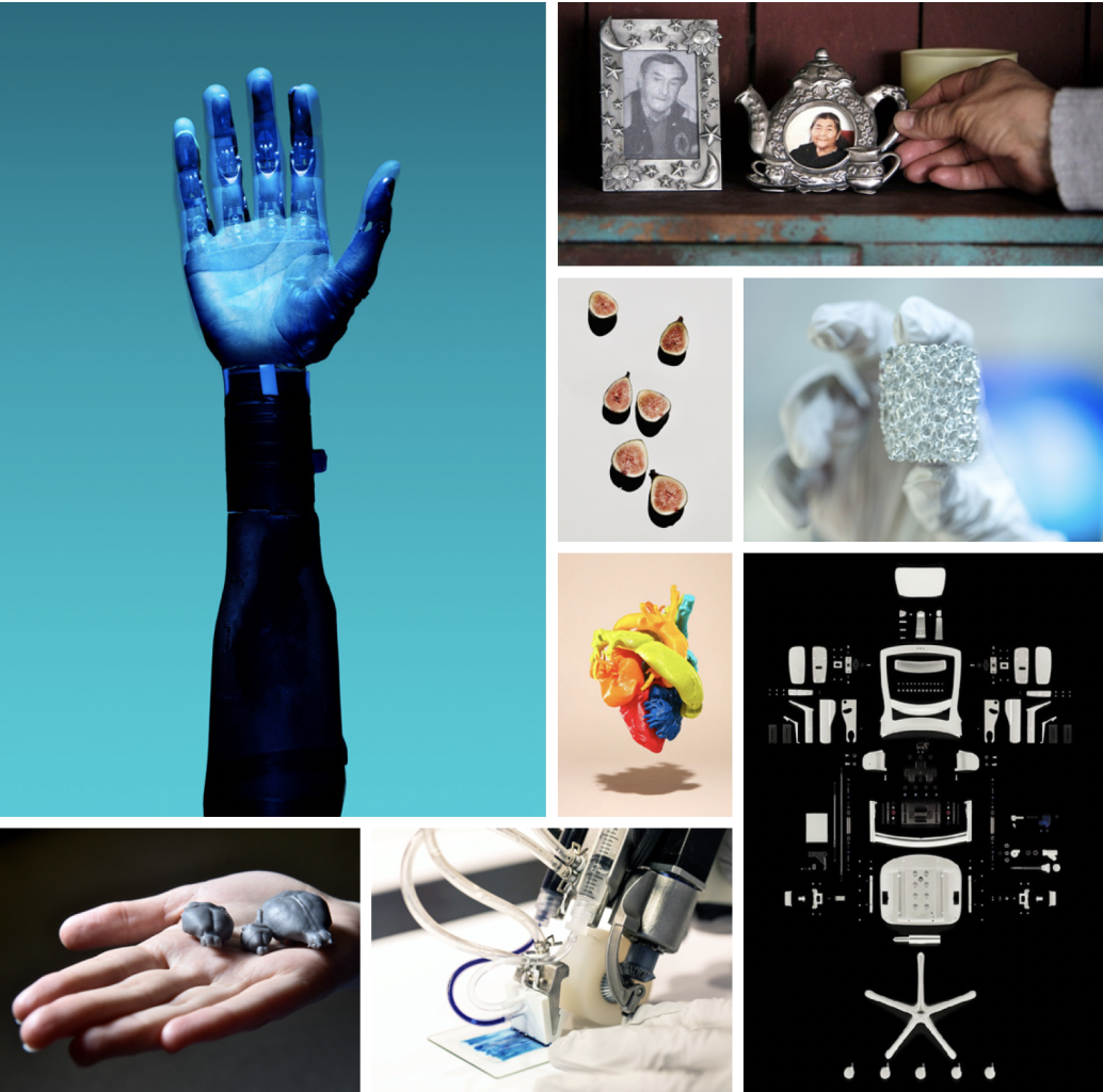
Our Photojournalistic Approach
Photography plays an integral role in bringing our brand idea to life.
We have taken a photojournalistic approach to photography. To achieve this, the images we use should feel organic, dynamic, and in-the-moment— authentically capturing snapshots that provide a window into the incredible work of our U of T community.
Photography that includes people should always reflect our diverse community.
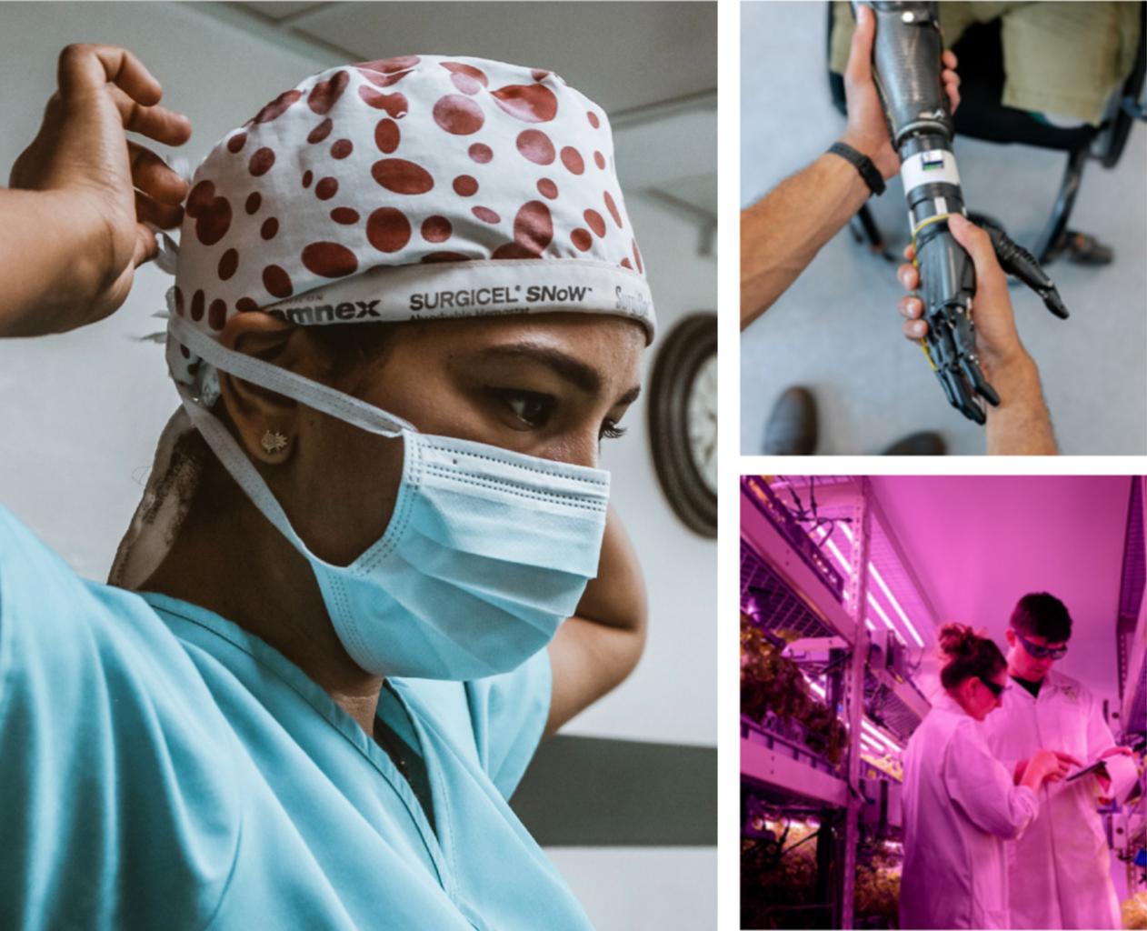
Note: Whenever possible, we recommend capturing new photography that authentically features U of T and our community. However, we understand that is not always possible. In these situations, existing U of T images and stock photography is an acceptable alternative.
Photography Styles


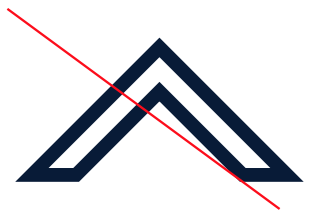
The Caret
![]()
Graphic Device
The Caret is a fundamental element of the Defy Gravity brand. We use the Caret as a graphic device to express, support, and reinforce our brand identity and convey the feeling of momentum and the importance of rising above any challenge.
It visually conveys upward momentum—always ascending and expanding. In programming and math, it signifies exponential power.
The Caret can be used as a solid shape or as an outline. Use the Caret selectively—avoid overuse or use without purpose.
The Caret as a graphic device can be creatively and dynamically adapted to add visual interest to any piece. In print pieces, such as reports, the Caret can be die-cut, embossed or debossed onto covers. For video it can come to life with the use of animation and motion.
Improper Usage
These examples illustrate improper use of the Caret. Altering or manipulating the approved artwork is never permitted. Only reproduce the Caret from approved electronic artwork.
Note: These are examples only and are not a complete list of incorrect usage.
In web, to avoid improper Caret usage and to distinguish between the Caret and common navigational elements, like “back to top” buttons or upward scroll arrows, we recommend using a filled triangle or an arrow with a stem.

Do not rotate the Caret in any way; it should always point upwards.
Do not combine the Caret with another mark or other graphic symbols and elements.
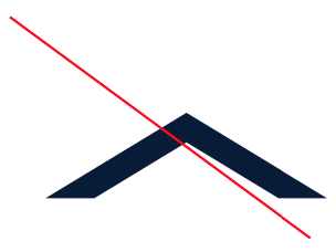
Do not distort the Caret.
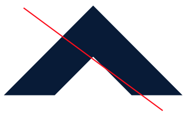
Do not alter the thickness of the Caret.
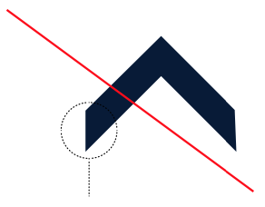
Do not alter the base of the Caret
Do not use a thick stroke that compromises the integrity of the shape of the Caret.
Applied
We use the Caret as a graphic device in a variety of ways to strengthen the brand while adding visual interest in design.
These are just a few examples of how to use the Caret in layout.
Enlarged and Cropped Crop to achieve dynamic angles. Anchoring Imagery Overlay to visually anchor floating imagery. Stacked Stack to highlight collaboration and inclusivity. As an Accent Add as a small design accent to call attention to important information.
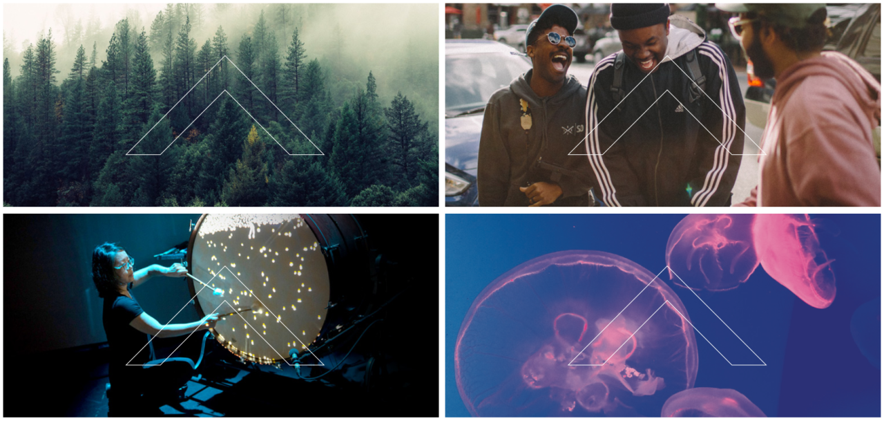
Enlarged and Cropped
Crop to achieve dynamic angles.
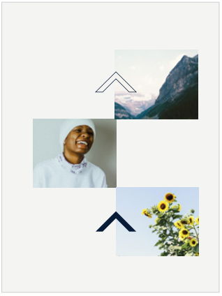
Anchoring Imagery
Overlay to visually anchor floating imagery.
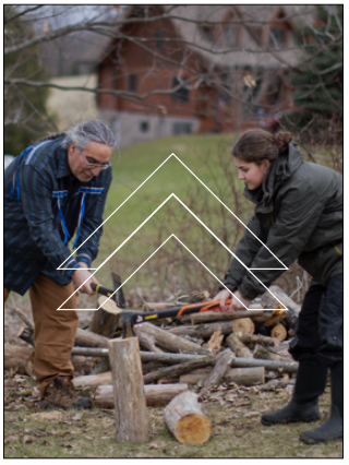
Stacked
Stack to highlight collaboration and inclusivity.
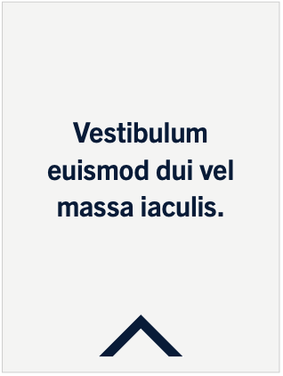
As an Accent
Add as a small design accent to call attention to important information.
The Brand in Action
Explore examples of our brand in action, serving as inspiration and showcasing best practices.
Ready to get started? Discover our brand assets available for download.
We’re Just Getting Started
As we roll out our new brand, the details and contents of this site will change and evolve. Check back frequently for updates.